If your website’s conversion rate is dropping and you don’t know why, it’s time to take a closer look. Bad typography could be part of the problem. When your text is too small, too crowded, or hard to read, people won’t stick around, even if the content is good.
That’s why smart web designers choose modern web design typography to improve user experience and build trust. The right fonts, spacing, and layout help people read more easily and feel confident about what they’re seeing.
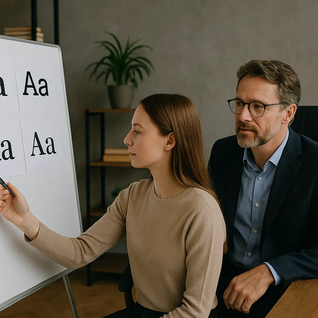
We’ve worked on plenty of sites where a simple font change made everything feel more professional and easier to read. Good typography looks better and works better, too.
In this guide, you’ll find:
- A clear look at what modern web typography means
- Fonts that match your brand and sound like you
- Easy fixes to improve readability across all devices
- How font choice affects trust and conversions
Ready? Let’s get into it.
What Is Modern Typography in Web Design?
Modern typography in web design is used to make content easier to read, more consistent, and visually balanced across all devices. Of course, modern typography helps you choose a nice font. But it balances how that font works on a screen, whether someone is reading on a phone, tablet, or laptop.
Unlike print fonts, digital or modern typefaces are built with screen clarity in mind. They need to stay sharp at different sizes, load quickly, and stay readable in all kinds of lighting. That’s why many modern web fonts are simple, open, and clean. They’re made to do the job without slowing readers down.
And then there’s rhythm, or the way your text flows on the page. Using consistent headings, line height, and spacing keeps things moving in the right order. A steady layout like this helps people move through your content without effort.

When you get these basics right, you change how people experience your content. That’s the foundation for everything else we’ll explore, like layout, font pairings, and interactive type.
Website Typography Tips to Improve Readability and Flow
Good typography guides the reader’s eye, adds structure, and helps your message come through clearly. When fonts, spacing, and layout work well together, your website becomes more comfortable to explore. People are more likely to stick around when reading doesn’t feel like a chore.
Here are a few helpful ways to make your text clearer and your design feel more open:
- Use font hierarchy to build structure: Most people scan a page before they start reading. So your headings should stand out clearly, and subheadings should give structure. Also, body text needs to feel smooth and consistent. This structure gives people quick cues on where to begin and what to expect.
- Tight layouts push readers away: If your text feels cramped, it’s harder to take in. So, we recommend you aim for a line height of around 1.5 and leave enough space between paragraphs (about 1.5 times the font size). Spread out your paragraphs a little, so that the whole page feels more open and easier to take in.
- Fonts can say more than words: Ever felt that some text just feels “off”? Typography has tone. Different font styles feel different. A soft, rounded font can feel friendly and open, while sharper styles feel serious or bold. Choose fonts that match your brand’s mood and keep them easy to read, especially on smaller screens.
- Check how it looks on mobile: Text that looks fine on a desktop can feel squashed on a phone. Use font sizes that adjust to screen width and always test on real devices. A mobile-friendly layout means fewer drop-offs and more clicks where it matters.
Pro tip: Stick to two or three font styles across your site. Using more than that can make the design feel messy. A simple, clean setup makes everything feel more polished.
These tweaks might seem small, but they completely changed how one of our clients’ homepages performed. After we helped them adjust type sizes and layout spacing, their homepage bounce rate dropped by 27% in just two weeks. Isn’t that great?
If your page is easy to read and easy to follow, people will keep going. So let’s take a look at some of the best fonts you can use to make that happen.
What Are the Best Fonts for Websites Right Now?
The best fonts to use in a website right now are Open Sans, Roboto, Lato, Poppins, Inter, and Merriweather. These fonts are widely used because they’re easy to read, look clean on all screen sizes, and load quickly.
You can use them on all kinds of websites, including blogs, business pages, and online stores. These popular fonts support your layout without distracting from your message, which helps visitors stay focused and engaged.
Here’s a closer look at some of these top fonts and what makes them work:
- Open Sans – Clear and Simple: Open Sans is one of the most used fonts on the web, and for good reason. It’s easy to scan, flexible across layouts, and feels friendly without being too casual. Besides, it performs well for both body copy and UI text. That’s why you’ll find it in many Google fonts collections.
- Roboto – Modern and Versatile: Designed by Google, Roboto mixes straight lines and soft curves. It’s ideal for clean pages and works well on tech, lifestyle, or blog sites. You’ll often see it paired with bold headers like Inter font. Its design enables readability for many users, including those with visual impairments.
- Lato – Friendly and Professional: Lato feels warm but still well-structured. It has just enough style to give your text some personality, while staying easy to read on both mobile and desktop. Its taller letters make small text easier to follow, and the open shapes help the words feel less cramped.
- Poppins – Stylish and Readable: If your brand feels fun or modern, Poppins is a great choice. It adds energy without making things hard to read. Use it for headings, buttons, or short messages. For longer paragraphs, it’s best to pair it with a simpler font.
Studies show that the fonts you choose matter for how users read and interact with your content. Research has found that sans-serif fonts like Verdana are easier to read on screens. This means people understand and remember more of what they read when the text is clear and simple (and that often leads to easier conversions, too).
If you’re still working out which fonts suit your site, tools like the Chrome extension of Font Finder or Font Generator let you compare options side by side. You can also use the font checker from WebFX to preview how your fonts will look in different browsers. And if you want more variety to explore, sites like Dafont offer thousands of free styles to try.
Once your fonts feel right, it’s time to put them to work. Things like layout, size, and spacing help tie everything together, and that’s what we’ll look at next.
How Typography Guides What People Notice and Do
Typography helps people know where to look, what to read first, and what to click next. It brings structure to your page and gives visitors a smooth path to follow. If you use the right kind of typography on your page, people will be able to read your content more easily and with greater focus.
Large headings are like stop signs because they grab attention, and subheadings break things up and give helpful clues. Clean and consistent body text makes longer content easier to take in. When everything is arranged well, people feel calm and tend to stick around. It’s a bit like walking into a tidy room, where your brain instantly feels calmer.
Even line spacing matters too. When text lines are too tight, reading slows down, especially on mobile. A bit more space between lines makes it easier to scroll, scan, and stay focused. No one wants to pinch and zoom just to get through a paragraph.

Then there’s the text you want people to click (like buttons, menus, or links). These small bits need just as much care. To make them stand out and work better, try this:
- Use a bigger font for action items
- Add bold text or colour to show what’s clickable
- Keep styles consistent across your site to avoid confusion
- Use simple, clear labels (bonus if they include Font Awesome icons or fa icons to guide attention)
We once helped a client whose homepage felt confusing. They had great content, but people didn’t know where to start. After changing their headings, spacing, and buttons, visitors began staying longer and clicking more. As the client said, “It finally feels like the site knows where it’s going.”
So, typography doesn’t just dress things up. It helps users stay on track, stay engaged, and enjoy being on your site.
Let Your Website Speak With Clarity
Typography is one of those simple tools that changes how people move through your website. It guides visitors, makes your message easier to take in, and helps your brand come across in the right way.
We’ve looked at how web design improves when you choose the right fonts, keep your layout consistent, and think about how things read on every screen. From headings to buttons, every choice you make with your text has an impact.
If your site feels hard to read or doesn’t quite reflect your brand, checking the typography is a good place to start. Even small adjustments can make the content feel cleaner and more inviting.
Want to improve how your site looks and reads? Visit Philadelphia Bar and Restaurant to see how smart design and better typography can help your website work better for your visitors.