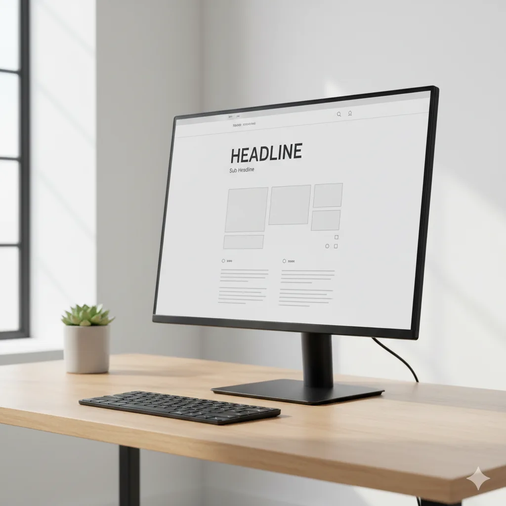
Intentional design choices make a website feel carefully crafted. Every colour, spacing decision, and button placement exists for a reason, not because a template dictated it.
You can usually tell within seconds whether a site was built with care. The layout feels off, the fonts don’t quite match, and something about the whole thing just doesn’t sit right. Even if you can’t pinpoint exactly what’s wrong, your gut picks up on it.
Custom website design solves that problem. We’ve built websites for bars, restaurants, and hospitality businesses across Australia, and through that work, we’ve seen what separates a site that builds trust from one that sends visitors clicking away.
This guide walks you through what separates thoughtful website design from rushed builds. You’ll see how visual hierarchy, spacing, calls to action, and micro-details all shape the way visitors experience your site.
Visual Hierarchy and Why Your Own Website Needs It
Have you ever landed on a website and had no idea where to look first? That’s a visual hierarchy problem.
Visual hierarchy controls the order in which visitors notice elements on your page. Size, colour, and placement all tell users what to focus on and where to go next. Here’s how each element plays its part.
How Size, Colour, and Placement Control Attention
Larger elements naturally grab attention first, which is why a bold headline pulls the eye before smaller body text does. Colour reinforces this effect, as a bright button against a neutral layout stands out instantly. Designers then position key elements along natural scanning paths so visitors flow through the page without friction.
What Happens When Hierarchy Is Missing
Your own website loses visitors when hierarchy breaks down. People feel confused and click around without direction, which often leads them to leave for a site that feels easier to use.
Even the Australian Government’s Digital Service Standard emphasises that users should find what they need without guessing, and a clear hierarchy makes that possible.
Now, let’s look at the subtle visual cues that guide visitors without them even noticing.
Visual Cues That Guide Visitors Without Them Noticing
The best websites lead visitors exactly where they need to go without a single instruction on the page. These subtle visual cues shape user behavior in the background, and most people never even notice them. For example:
- Directional Elements: Arrows, whitespace, and eye direction in photos subtly point visitors toward buttons, forms, or key information.
- Invisible Guidance: Believe it or not, good visual cues feel completely invisible. Site visitors follow them naturally because the design does the heavy lifting.
- Contrast and Spacing: Colour contrast and strategic white space create clear pathways across your layout, and a well-placed gap draws the eye just as effectively as bold text.
When these cues work together, visitors move through your site with ease and never feel pushed in any direction.
Clear Calls to Action That Don’t Feel Pushy
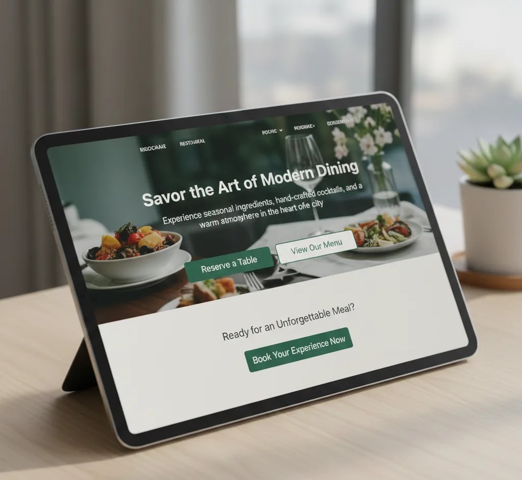
How many times have you clicked away from a site because every button felt like a sales pitch? If that sounds familiar, you’ve experienced pushy calls to action firsthand (we’ve all clicked away from those).
Clear calls to action invite clicks without making visitors feel pressured, and the trick lies in wording and placement. Let’s look at how both work together.
Why Wording and Placement Both are Important
Pushy buttons scream “BUY NOW” on every page, and they rarely convert the way you’d hope. Clear calls to action use specific language that tells visitors exactly what they’ll get. Placement reinforces this, as a button positioned after valuable content feels natural rather than desperate.
Calls to Action That Answer a Question
The best calls to action respond to something visitors already want to know. And once that’s established, the click feels like a logical next step.
For a restaurant site, “See the menu” or “Book a table” works far better than “Click here.”
Small Web Design Tips That Add Visual Appeal
Visual appeal comes from small, consistent choices rather than flashy effects or oversized graphics. And when every element on the page follows the same visual logic, visitors feel like they’re in good hands.
Spacing is a good place to start, as consistent gaps between elements make a layout feel calm and organised. HubSpot’s usability guidelines point out that white space helps users focus on the most important parts of your page.
From there, the focus shifts to typography. We’ve built enough restaurant sites to know that font choice sets the mood before anyone reads a single word. A playful script creates a different feeling than sleek, minimal type, and both work depending on your brand.
Social media icons deserve attention, too. These icons should blend into your layout rather than dominate it, so keeping them small and consistent in the footer lets visitors find them easily.
Why Drag and Drop Builders Aren’t Always the Best Website Builder Option
Simply put, builders save time upfront, but custom work gives you freedom that templates can’t offer. If you’re weighing your options, here’s how they compare.
| Factor | Drag and Drop Builder | Custom Code |
| Speed to launch | Fast | Slower |
| Flexibility | Limited by templates | Full control |
| Long-term control | Platform dependent | You own everything |
There’s no way around this: most drag-and-drop builders lock you into their platform. If you ever want to move your site elsewhere, you’ll likely need to rebuild from scratch (that’s a headache most business owners don’t see coming).
So which option makes sense for you? The best website builder for your situation depends on your goals. For quick launches and simple sites, a website maker with drag-and-drop tools works fine.
However, if you want unique branding and full functionality over the long term, custom code usually delivers better results.
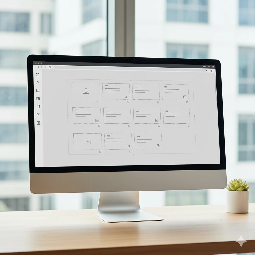
Different Types of Details That Make a Good Website Stand Out
Now that we’ve covered the big-picture stuff, let’s look at the finishing touches most people overlook. These small details separate a good website from one that feels incomplete.
- Loading Speed: Slow pages frustrate visitors and hurt your search rankings, so compressing images and cleaning up code should be part of your build process.
- Micro-interactions: A good website includes subtle responses like buttons that change colour on hover or images that fade in on scroll. One thing that keeps coming up when we test sites on mobile: tap targets need enough space so users don’t hit the wrong link.
- Finishing Touches: Different types of details, from favicon design to custom 404 pages, show visitors that someone cared about every corner. Follow GovCMS best practices to find out how these elements build trust.
When all these pieces come together, your site feels polished and professional rather than rushed.
It All Comes Down to Intention
Anyone can drop icons into a footer or pick a colour palette, but the difference shows in details that visitors never consciously notice. Consistent spacing, clear visual hierarchy, and calls to action that feel helpful all contribute to how professional your site feels.
Thoughtful web design builds trust with your audience because when everything feels intentional, visitors believe the business behind it operates with the same care. That perception sticks with them, and it influences whether they return or recommend you to others.
If you’re ready to build a site that reflects that level of attention, Philadelphia Bar and Restaurant can help you get started.