Consistent branding makes websites easier to remember because repeated colours, fonts, and messaging give visitors familiar cues they can recall later. Your visitors store those cues without trying, so the site feels familiar on the second visit.
Most small businesses lose that advantage by accident. You rebuild a page one year, swap a logo the next, and the website ends up looking like three companies share it.
This guide covers how repetition builds recognition, which brand identity pieces your web design needs, and how to keep every page on message. You’ll also see what consistency saves you across marketing.
Why Does Consistent Website Branding Make a Site Easier to Remember?
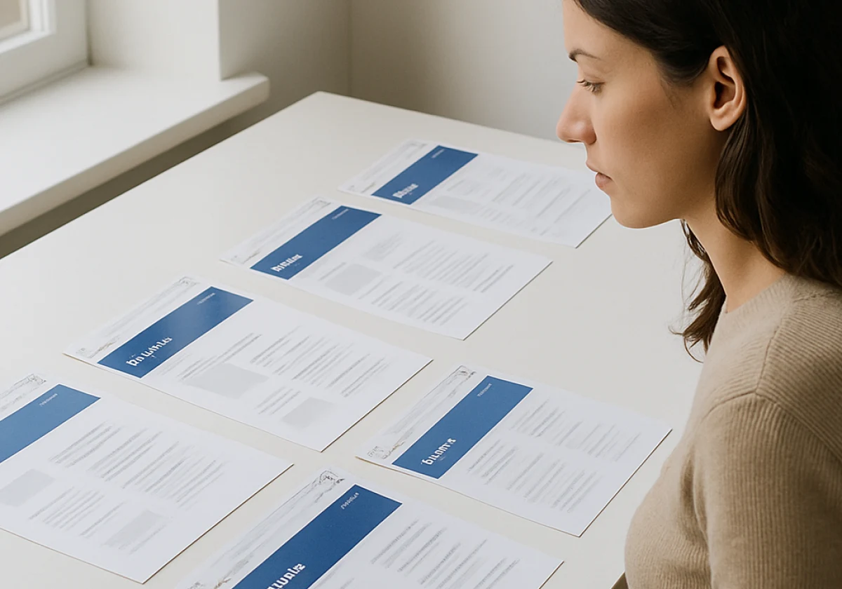
Strong website branding repeats the same colours, fonts, and voice on every page. Memory holds patterns better than one-off details, so repetition beats any single clever idea. Three forces explain the effect, and you can control all of them.
How Repetition Builds a Strong Brand People Recognise
Every time a visitor meets the same colours and tone, their brain files the experience in the same place.
After a few visits, your pages stop reading as new information, and visitors know whose site they’re on before it finishes loading. Change the look too often, and that filing system collapses. Visitors start from scratch each time, which wastes recognition you had already earned.
Branding Elements: Colour, Logo and Typography as Memory Cues
Colours and shapes reach memory faster than words, which is why your colour palette and logo carry so much load. Plenty of people picture a brand before they can name it, and you’ve probably done exactly that this week.
Typography works the same way, only quieter. One heading font across every page tells readers they haven’t left your site (a small signal that adds up over a dozen pages).
Keep these elements fixed and your brand does the remembering for you. Fonts that change page by page often hand that job straight back to the visitor.
Why First Impressions Stick With Website Visitors
First impressions stick because people don’t take long to judge a site. Judgement comes long before they read a word of your copy.
Researchers at Carleton University found that visitors form an opinion in as little as 50 milliseconds, and that snap judgement colours everything they read afterwards. In practice, a homepage that matches your social media profiles confirms what the visitor expected to find. Readers who recognise the look settle in instead of checking the address bar.
A mismatch, however, does the opposite. People pause, wonder whether they’ve landed in the right place, and many leave before you make your case.
Brand Identity Basics: The Elements of Website Branding
Once you know why consistency works, the next question is what to keep consistent. A clear brand identity keeps each page on message. Without one, every new page becomes a fresh set of decisions.
Four building blocks do most of that work, and together they’re what people mean by website branding.
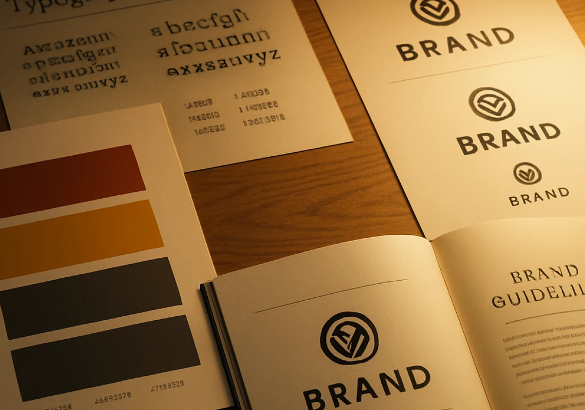
- Logo Design Files: Your logo needs a wide header version, a square social tile, and a small favicon. Export each as both PNG and SVG so your developer and your printer can use whichever they need. One file stretched into every slot looks wrong in at least two of them.
- A Fixed Colour Palette: Choose three or four colours and record the hex codes in a shared document or style guide. Reserve one colour for buttons and calls to action so every page drives the same visual cue. Designers and developers then match your colour scheme instead of guessing at it.
- Typography Set: Two fonts handle most sites, one for headings and one for body text. Record the font names, weights, and sizes in the same document as your colour palette so every page uses the same settings. Any more than two fonts and your pages start competing with each other.
- Brand Voice Rules: Write down three words that describe how your brand speaks, and keep them at the top of the style guide. When a new writer picks up the next page, those three words hold the tone steady. Without them, every writer invents a new voice, and the site drifts.
Pin these four down in one document, and you have a working brand strategy. The brands that hold together are the ones that wrote it down before the second designer arrived, so every freelancer and developer works from the same source.
Bringing Branding and Design Together Across Every Page
Most small businesses treat business branding and web design as separate projects, and website visitors can tell straight away. Looking professional sits among Stanford’s credibility guidelines for good reason, and a site that changes character halfway through fails that test.
If you’ve rebuilt a site in stages, you already know the join shows up first on the contact page (usually the oldest page you own and the least loved). This comparison shows what changes when the two work together.
| Page | Branding handled separately | Branding and web design together |
|---|---|---|
| Homepage | Polished and on brand | Polished and on brand |
| Services page | Stock photos, new fonts | Same palette, same voice |
| Contact form | Default button colours | Brand colours, your wording |
| Footer and privacy policy | Plain template text | Same tone as everywhere else |
Treat the whole site as one design job where every page reflects your brand identity. Building a site in stages is what lets those gaps open.
How a Consistent Brand Strengthens Your Marketing Beyond the Website
Beyond the site itself, the payoff of brand consistency is marketing that costs less because your target audience already recognises you. Every ad, post, and email lands warmer when it carries the colours and voice people saw on your website.
Paid and Organic Channels
The advantage shows up fastest in paid channels. Google Ads traffic arrives cold, and a branded website has only moments to reassure potential customers they reached the right company. A landing page that matches the ad keeps that promise, while a generic one breaks it.
Keeping Your Team on Brand
Unpaid channels gain too. Social media posts, email campaigns, and the pages SEO brings in all lead back to the same site. Each channel strengthens the others when the branding matches. Try opening your profile and your homepage side by side, and any gap in your website’s branding quickly shows up (a free audit that takes about five minutes to run).
Consistency pays off inside the business as well. Make sure everyone pulls logos and colours from the same shared folder, and your online branding stops drifting across digital marketing campaigns. From what we’ve seen during our work with clients, the drift starts the moment one person builds a flyer from memory. And that’s how returning customers end up meeting two versions of you.

Brand Your Website So People Remember It
A memorable website comes from the same colours, fonts and voice showing up on every page you publish.
So pick the brand pieces already working and apply them everywhere, starting with the pages behind your homepage. Small fixes made consistently beat a rebrand you keep putting off.
Philadelphia Bar and Restaurant shares practical branding and web design advice for small business owners. Contact us for a look at your current website, and let’s build one people remember.