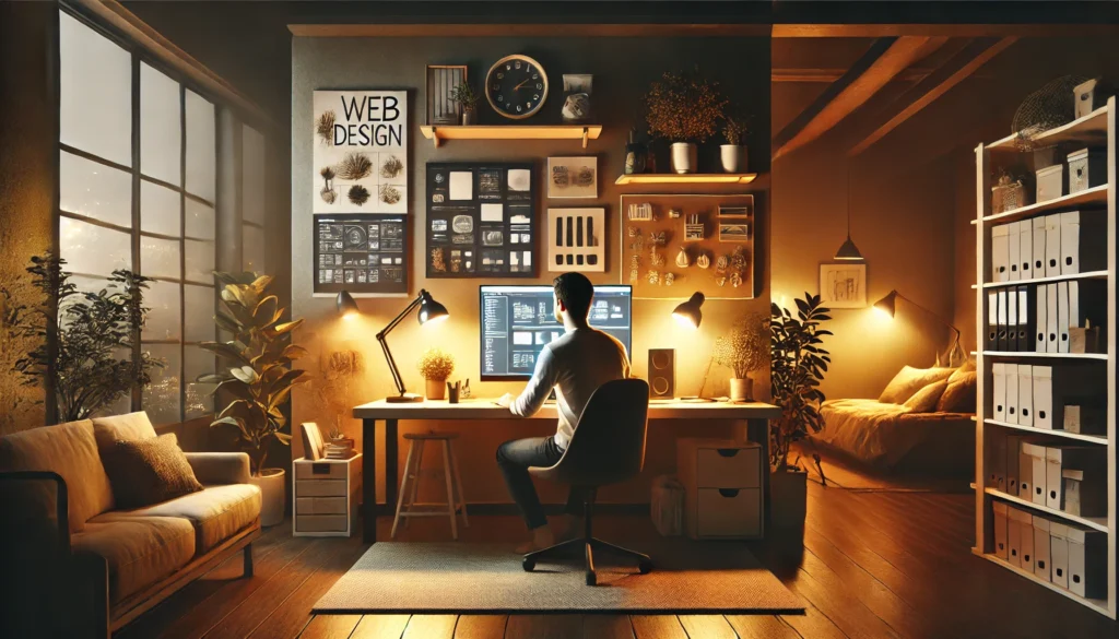
Web design, much like a perfectly plated dish, is about presentation, engagement, and experience. Imagine stepping into a beautifully designed restaurant. The lighting is warm, the ambience inviting, and the menu is an experience in itself. Before you even take a bite, the presentation of your dish tells a story—thoughtfully arranged, with colours and textures balanced to perfection.
Now, imagine if your website could create that same emotional connection with visitors. What if the way your site is structured, designed, and interacted with evoked curiosity, delight, and trust—just like a well-planned dining experience?
Common Pitfalls in Web Design:
Many websites fail to make a lasting impression due to:
- Predictable templates that lack originality.
- Confusing navigation leads to high bounce rates.
- A lack of engaging elements makes users leave too soon.
But what if the food and beverage industry held the key to designing immersive, visually compelling websites? Restaurants have perfected the art of presentation, interaction, and storytelling—and web designers can apply these same principles to craft more engaging digital experiences.
What You’ll Learn
In this article, you’ll discover:
- How plating and presentation influence visual hierarchy.
- Why great UX is like an intuitive restaurant layout.
- The secret behind responsive design is that it adapts like a food truck.
- How branding and storytelling shape user engagement.
- Why sensory elements like animations and interactivity matter.
By the end, you’ll have practical, creative strategies to transform your web design into an experience that delights users and keeps them coming back for more.
The Art of Presentation: How Plating Translates to Web Aesthetics
Before a dish is tasted, it’s seen. The arrangement, colour palette, and negative space on a plate influence perception—just as a well-structured web page affects user engagement.
- Balance and Composition: In fine dining, plating is intentional—every element has a place. Web design should follow suit with a clear visual hierarchy.
- Minimalism vs. Opulence: Some dishes are minimal, while others are vibrant and complex. Similarly, some websites thrive on minimalist design, while others benefit from bold, rich aesthetics.
- Quick Win: Use grid layouts and whitespace effectively to enhance readability and visual appeal.
The User Experience (UX) and the Dining Experience: Designing for Engagement
Ever been to a restaurant where the menu is a nightmare to navigate? Too many options, confusing categories, and hard-to-read fonts? That’s how visitors feel when they land on a poorly structured website.
What Makes a Great UX?
- Intuitive navigation – Users should find what they need in seconds.
- Strategic menu placement – Just like restaurants highlight best-selling dishes, websites should optimise CTAs.
- Smart use of colours – Fast-food brands use red and yellow to trigger appetite, while premium restaurants opt for earthy, muted tones.
- Quick Win: Conduct heatmap analysis to see where users click most and adjust accordingly.
Data-Backed Insight: The Australian Government’s Digital Transformation Agency emphasises user research to reduce assumptions and improve service delivery (digital.gov.au).
Responsive Design: The Key to Seamless User Experience
A fine-dining restaurant is fixed in place, catering to an exclusive crowd. A food truck, however, moves to meet demand, changing menus and adapting to its audience. Your website should work the same way—providing a seamless experience across devices and adapting to user needs.
Why Responsive Design Matters
- Better User Engagement: Visitors expect websites to be fully functional on any device. A non-responsive site leads to frustration and high bounce rates.
- SEO Benefits: Google prioritises mobile-friendly websites, meaning responsive design directly impacts search rankings.
- Faster Load Times: A responsive, well-optimised website improves speed, enhancing user retention.
Practical Implementation
- Use a Fluid Grid System – Ensure elements resize dynamically instead of fixed-width layouts.
- Implement Flexible Images & Media Queries – Optimise visuals so they scale proportionally.
- Prioritise Mobile-First Design – Design with small screens in mind before scaling up to desktops.
- Test Across Devices – Use tools like Google’s Mobile-Friendly Test to spot potential issues.
Quick Win: If your website isn’t optimised for mobile yet, start by checking your analytics to see where most of your traffic comes from and optimise accordingly. Over 70% of Australians access the internet via mobile devices (abs.gov.au).
A fine-dining restaurant is fixed in place, catering to an exclusive crowd. A food truck, however, moves to meet demand, changing menus and adapting to its audience.
Storytelling in Design: The Brand’s Signature Dish

Every restaurant has a story—whether it’s a family-owned trattoria with recipes passed down for generations or a fusion concept pushing creative boundaries. The same applies to brands.
Why Storytelling Matters in Web Design
- Emotional Connection: Users remember stories more than facts.
- Typography & Aesthetics: Fonts set the mood and tone of your brand.
- Case Study: Starbucks leverages storytelling through immersive visuals and customer narratives.
- Quick Win: Keep your brand messaging consistent across all touchpoints, from web copy to social media.
Sensory Engagement: Designing for More than Just the Eyes
A great dining experience isn’t just about taste—it engages multiple senses, from the aroma of freshly baked bread to the warmth of ambient lighting. Web design should create similarly immersive experiences that captivate users beyond just visuals.
How to Elevate User Engagement with Sensory Design
- Micro-Interactions & Animations – Subtle movements like hover effects, button transitions, and scrolling animations create a more interactive experience.
- Sound & Haptic Feedback – Adding soft background sounds or gentle vibration cues for mobile users can reinforce interactions.
- Texture & Depth in UI – Using shadows, gradients, and layered effects mimics depth and tactility, making digital experiences feel real.
Real-World Example
E-commerce brands use interactive 3D product previews to let customers rotate and zoom in on items, mimicking an in-store experience. Websites like Apple and Tesla use fluid animations to guide users through an immersive storytelling journey.
- Quick Win: Start small—add subtle animations to CTAs or interactive feedback on form inputs to make your site feel more dynamic.

Great restaurants appeal to multiple senses—aroma, texture, sound, and sight. Similarly, great web design should offer multi-sensory engagement beyond static visuals.
Elevate Your Web Design with Fresh Inspiration and Responsive UX
Web design, much like an exceptional dining experience, relies on careful planning, sensory engagement, and seamless navigation. By applying principles from the food and beverage industry—such as intuitive layout, responsive design, and compelling storytelling—you can create digital experiences that captivate and convert visitors.
Final Takeaways
- Think like a chef – Every element of your site should have a purpose.
- Prioritise mobile-friendliness – It’s no longer optional.
- Leverage storytelling – Build an emotional connection with users.
- Incorporate sensory engagement – Use animations and interactivity strategically.
- Quick Win: Audit your website today—identify areas where UX, design, or responsiveness can improve.
Need help implementing cutting-edge responsive design, enhancing user experience, and boosting engagement? Let’s collaborate with PBR Web Design and create something extraordinary.