Remember how last week, you found yourself making a cup of tea while waiting for your website’s photos to load? Guess what: your visitors aren’t as patient as you, and they’re probably already browsing your competitor’s lightning-fast site instead.
At PBR Web Design, we’ve seen how the right image strategy works. Proper optimisation keeps your site looking great while loading in a flash.
In this guide, we’ll walk you through compression tricks to keep your images looking sharp, sensible image format choices, and lazy loading techniques. We’ll also introduce you to some tools that’ll make your site load extra fast, so you’ll benefit from higher rankings and better user experience.
Let’s ensure your website looks amazing and loads instantly. Read on to learn more about how you can achieve this balance.
Why Image Optimisation is Vital for Web Success
Your website’s images directly affect how your visitors experience the site and how search engines rank you. Slow-loading visuals usually send them straight to your competitors. Google also knows the reason why visitors leave slow sites.
You know what’s crazy, though? If your page takes one extra second to load, you lose 7% of potential customers. That’s actual money disappearing because someone’s images are too chunky. When was the last time you waited around for a slow website (apart from yours)? Yeah, exactly.
Images make up about 60 to 70% of what your page weighs, so if you’re not optimising them, you’re telling Google, “Right, I don’t really care if people have a good time here.”
For your own sake, you must get this right to improve your visitors’ experience and climb the search results.
Impact on User Experience and Engagement
When images load slowly, there’s this weird anxiety building up. You’re scrolling, waiting for things to appear, and your brain gets impatient. It’s like waiting for someone to finish a sentence, but they keep pausing.
But when everything loads smoothly? People stick around longer. Sites with optimised images see visitors hanging about for about 40% more time. More time means more trust, more product views, and more of whatever you want people to do.
SEO Benefits: Ranking Higher with Optimised Visuals
Google’s algorithm treats slow websites similarly to that friend of yours who’s always late for dinner. They simply can’t get close to the head of the table (the top of search results). If you didn’t know, page speed has been a confirmed ranking factor for websites.
If you optimise your images properly, you can improve your Largest Contentful Paint (LCP) scores in Google’s Core Web Vitals by up to 50%. Don’t forget to add good alt text and descriptive filenames too (not just “IMG_1234.jpg” or whatever). You’re basically giving search engines subtitles for your content.
Seems like such an easy win that most people don’t do.
How to Choose the Right Image Format and Quality
The appropriate image format and quality settings are the foundation of effective image optimisation. Different formats work great in different situations, and your choice influences both your image’s appearance and the loading speed for your visitors.

Each format also has its own little personality. Some are perfect for photographs (all those smooth gradients and colours), while others are good for graphics with clean, acute lines. Then you’ve got these newer formats squeezing files down to almost nothing but still looking gorgeous.
The thing is, your visitors won’t have a clue about these technical bits. They won’t know if you’re using JPEG or WebP or whatever. But they’ll definitely feel it when your pages load quickly. It’s one of those invisible improvements that make everything feel more refined.
Decoding Image File Formats for Web
Once you’ve figured out which image format works best for your work, you’ll save loads of bandwidth and render your images faster on your website. It’s a bit like choosing the right tool for a job. You wouldn’t use a hammer to fix a watch, would you? Same principle here.
Here’s how the main formats look for your web use:
| Format | Best For | Benefits | Considerations |
| JPEG/JPG | Photographs and complex images with many colours | Excellent lossy compression, small file sizes | Some quality loss, no transparency support |
| PNG | Logos, graphics with sharp edges, and images needing transparency | Lossless compression supports transparency | Larger file sizes than JPEG |
| SVG | Vector graphics, icons, and simple logos | Infinitely scalable, tiny file sizes | Only works for vector-based graphics |
| WebP & AVIF | All image types if your browser supports | Superior compression and quality | Requires fallback options for older browsers |
Image Compression Tools and Delivery
Modern compression tools can shrink any giant image files dramatically while keeping quality intact. Some options are simple point-and-click, while others give you precise control over every setting.
How much control, you ask? Well, you can reduce file sizes by 60-80% without visible quality loss. You can get that 2 MB product shot of yours down to 400 KB, and it’ll still look professional (compression: the unsung hero of page loading speed!).
Combine this with clever loading techniques like lazy loading and responsive images, and your site becomes quick and smooth for every visitor.
Faster load times mean happier users. And when users are happy, everyone wins.
Online and Desktop Compression Software
You know how image files love to balloon up for no reason? Well, good compression software can handle all that annoying size stuff in the background. No more wasting afternoon hours squinting at quality sliders (we’ve all been there).
Now you can focus on making cool content instead of playing whack-a-mole with gigantic files. But even then, maybe you’re thinking, “Sure, which tools?”

Okay, so here are a few tools that won’t make you want to throw your laptop:
- TinyPNG and TinyJPG: Popular online drag-and-drop tools for quick, efficient lossy compression. The results work brilliantly for most web images.
- ImageOptim (macOS) or FileOptimizer (Windows): You get more control over compression settings and batch processing of hundreds of images at once with these desktop applications.
- Squoosh: Google’s web app for advanced image compression and format conversion. It allows real-time previews, so you can see exactly how your changes affect quality.
- WordPress Plugins (e.g., Smush, ShortPixel): These compression plugins automatically compress images upon upload. They’re perfect for busy content creators unwilling to process every image manually.
Advanced Image Delivery Techniques
Effective delivery methods optimise how your compressed images reach your visitors to make their experience even better. Here are some great image delivery techniques for you:
Lazy Loading
The Lazy Loading strategy delays loading images until visitors scroll to them. It means your site doesn’t waste time loading twenty photos when someone’s only looking at the first three.
It’s like having a bouncer for your images. “You there, hero image? Come on in. Random product shot #17? Wait your turn.”
Responsive Images (srcset and sizes)
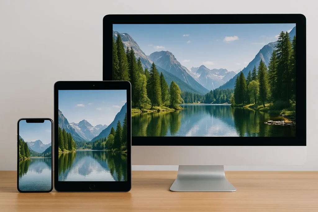
Responsive image methods serve your visitors different image sizes based on their device and screen resolution. Why send a massive 2000px wide image to someone scrolling on their phone, right? It’s common sense.
Content Delivery Networks (CDNs)
The content delivery system distributes your images across global servers and provides them from locations closest to your visitors. Say, instead of making someone in Australia wait for images to crawl across the ocean from your server in London, a CDN keeps copies closer to home.
Examples of popular CDNs include Cloudflare, Amazon CloudFront, Akamai, etc.
Optimising Visuals for Mobile Hospitality
Hospitality websites face unique challenges: they need to show mouth-watering food photography, create atmosphere through hero images, and display detailed menus, all the while loading instantly on mobile devices.
A slow-loading restaurant website loses hungry customers faster than you can say “table for two”.
We’ve developed these strategies below to keep mobile visitors engaged from the moment they land on your site:
- Menu Image Clarity: High-resolution menu images need special compression to load within 2-3 seconds. But they need to maintain enough detail for customers to read descriptions clearly. Use WebP format with JPEG fallbacks to achieve optimal quality-to-size ratios.
- Hero Visual Impact: Your website’s hero image sets the mood instantly. You can optimise these large visuals using progressive loading techniques so visitors see a low-quality version immediately, followed by the full-resolution image.
- Event & Gallery Efficiency: Image galleries displaying events or venue tours benefit from lazy loading and thumbnail previews. Let initial thumbnails load quickly, then serve full-size images only when visitors tap to view them.
- Above-the-Fold Prioritisation: You should prioritise your most attractive content first here. Daily specials, featured cocktails, or signature dishes should appear instantly, while below-the-fold images should load as visitors scroll.
- Device-Specific Image Delivery: Modern delivery systems can detect mobile devices and network conditions and serve appropriately sized images. A visitor on 4G gets different image sizes than someone on WiFi. It ensures optimal performance regardless of connection quality.
We recommend that you do all of these just to ensure people can see your gorgeous food before they get impatient and order from somewhere else instead.
Common Mistakes and How to Avoid Them
You’ve probably thought shrinking image files would be simple. Yet somehow, we still see sites where product photos look like they’ve been through a particularly aggressive washing cycle (seriously, what happened there?).

Most people either go too hard on compression or forget there’s more to speed than file size. Here are five mistakes we frequently see, along with quick fixes:
- Excessive Compression: If you push JPEG quality below 60%, it produces visible artefacts, and suddenly, your gourmet burger looks like a child’s finger painting. That’s why we recommend maintaining 70-85% quality to preserve your image’s visual integrity.
- Same Image for Every Device: It’s wasteful to use the same image for all types of devices. Responsive image methods sort this out by delivering the right file size based on the screen size your visitors are using.
- Loading Everything at Once: When all your images load immediately, they delay the whole page from rendering. Lazy loading is a brilliant solution for this (we’ve discussed it earlier in this article).
- Forgetting About Cache Settings: Without cache headers, browsers keep downloading the same images over and over again. So, set up your caching properly, and you’ll save bandwidth for returning visitors.
- Wrong Format for the Job: PNG for photos or GIFs for animations usually creates unnecessarily chunky files. Modern formats like WebP are usually much better at compression, to be honest.
Right, now go fix your images before your competitors steal all your customers.
Ready to Speed Up Your Website?
Slow-loading images cost you customers every single day. Your visitors expect instant satisfaction, and bloated files drive them straight to your competitors. Fortunately, proven optimisation techniques can solve this problem completely.
In this article, we’ve shown you how to choose the right image formats, compress without quality loss, implement lazy loading, and avoid common mistakes. These strategies work together to create fast-loading websites with your visual appeal intact.
Improve your website’s performance today. Contact us at PBR Web Design and let our team optimise your images for maximum speed and impact.